Tuesday, December 22, 2015
Thursday, December 17, 2015
Wednesday, December 16, 2015
Monday, December 14, 2015
Principles of design: Rhythm
This week in interior Design we are continuing with the different principles of design. Our task was to find 2 different pictures showing repetition, radiation, and gradation types of Rhythm.
My first 2 pictures portray repetition.
Friday, December 11, 2015
Emphasis
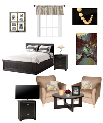
This week in Interior Design we were taking a look at the principles of design. Our main focus today, was Emphasis. We all drew from an envelope, and received a focal point. Our assignment was design an Olioboard room around that focal point. The focal point I drew was a window with curtains.
Monday, December 7, 2015
Great Gatsby Polyvore-2
For my second mood board, I was focusing a lot on the details from Get the Look: Great Gatsby style. There were lots of ideas of different accessories, and furniture options to create my second board. This website had 7 different piece of 1920's styled decor that I chose to put on my mood board. I incorporated Mirrored Furniture which was not rare to see in high society homes. They added a stylish and elegant look to the interior of the home. Geometric shapes were also a cool factor I chose to put on my board (blue wall with chair.) Geometric shapes were very popular in this style era, and were usually added to a powder room, or accent wall. Silky fabrics which give any room a touch of Hollywood glam. Lacquered furniture was another, and the appearance of this high gloss furniture was very glamorous. Polished metals create a look of masculine chic decor, and so do the glamorous lighting options. Lastly the glass accessories, which are one of my personal favorites, also add elegance and glamour to the room, depending on the piece.
Taking a look at Architectural Digest they touch on the look of Deco-inflected Furnishings, Contemporary art, and formal gardens. I think the piece of art I chose (on the top left) really adds a pop of color, and a cool feel to the room. I think the deco inflected furnishings found in the two photos of different rooms I chose (top) are also very interesting.
There were many different elegant, yet glamorous styles that were portrayed in the 1920's era. Although those are basically opposites, when combined they can create a magnificent feel and appearance to any room.
Thursday, December 3, 2015
Great Gatsby Inspired Polyvore
This past week in Interior Design we watched the movie "The Great Gatsby." Our task following the movie was to create 2 different Polyvore mood boards that reflect the style evoked in the movie for an interested client.
The style in this movie was a journey through the 1920's great style and architecture. The swinging twenties were defined by the Art Deco style - geometric shapes, streamlining and clean linens, and influenced greatly by the glitz and glamour of early Hollywood decor.
For my mood board I put a few pictures of winding staircases, marquetry flooring, and ornate crystal chandeliers. According to Architectural Digest the grandest creation was Gatsby's vast ballroom, the site of his legendary parties. The space features a gold-filigreed ceiling hung with ornate crystal chandeliers, a marquetry floor, towering columns between the windows, and a serpentine staircase-a flourish presumably installed by Gatsby. I thought that these were all beautiful features that could be put into the home.
Colors of the Gatsby talks about the main colors throughout the mansion in the movie The Great Gatsby. I have pictures on my mood board in the top right hand corner of some of the main colors, and also a picture of lavender flowers which was also a main color. The floors in this movie were dark and glossy. While the walls were creamy tones of stone or marble, and the warm woodwork color on the floor made the large space seemed much more inviting which I liked. Bold colors were used in some homes, usually in halls and virtually always paired with black. Green was the most used color, but needs to be very bright and full of life.
Lastly I added a couple small touches like the white flowers, the art, feathered pillow, and the couch on the top left. I did this because according to Designers go for the Gatsby Look It's all plumped cushions, muted yellows, plums, and warm cozy neutrals, It;s not very bold, but it sure does look comfy. There were also many floral designs, and big tapestries played a huge part in the movie, and in my room. I have a picture of the heavier drapes I chose at the top of my board, next to the big window which I really liked the look of.
There are many different things that contributed to this room, and I think the way everything fits together is so interesting and fun.
Subscribe to:
Comments (Atom)


