Thursday, January 7, 2016

Kitchen

I designed a U-Shape kitchen.  The U-Shape kitchen arrangement can offer the perfect working kitchen.  This will provide a great work flow for short distances to appliances, and lots of counter top space.

Thursday, December 17, 2015

Target Threshold Room

       All items used are from the Target Threshold/by Emily Henderson section except for the couch.

Monday, December 14, 2015

Principles of design: Rhythm


This week in interior Design we are continuing with the different principles of design.  Our task was to find 2 different pictures showing repetition, radiation, and gradation types of Rhythm.


My first 2 pictures portray repetition.
Repetition establishes rhythm through the repetitive use of an element.  It could be a color repeated, a group of art work, or even a place setting.  As long as the eye can connect from one object to another instead of jump around.  I chose this photo to represent repetition because of the horizontal stripes on the floor, and the horizontal beams on the ceiling.  These stripes can connect from one area to the other without jumping, and also lead your eyes down the hallway.
I chose this photo because there are many rectangles on the wall as well as on the carpet, the pillows, and the objects on the table.  All of these rectangles in varying areas of the room really lead your eye from one point to another.

My next 2 pictures portray radiation.

Radiation can give a room a room a circular, sweeping, rhythmic movement.  I chose this photo because the rounded windows and ceiling show radiation.  Along with the way the couch curves, and how the decorations are set up.

This room also shows radiation with the way the beams are set up, and also the floor and furniture.
My last 2 pictures portray Gradation.


Gradation by Rhythm, is Rhythm created by a gradual change in size or color.  Both of my photos show a gradual change in color.


Friday, December 11, 2015

Emphasis

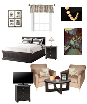
This week in Interior Design we were taking a look at the principles of design.  Our main focus today, was Emphasis.  We all drew from an envelope, and received a focal point.  Our assignment was design an Olioboard room around that focal point.  The focal point I drew was a window with curtains.


Asymmetrical balance

Symmetrical Balance