Blog Review
By: Taylor Boraas
The first blog I visited was Houzz. I enjoyed this site because there were pictures that truly amazed me. There were outdoor pools, stone paths with beautiful bonfire pits, and patio sets to match that I thought were really cool. I loved the modern feel to most of the rooms, but it still wasn't to edgy or over the top. I just loved the way that these rooms were set up, and the colors that were used in these designs. Adi and Alon created this site, as a place to browse and save beautiful home photos. A place to find the right design and construction professionals. Houzz started as a side project, but has become a community of more than 35 million homeowners, designers, and home improvement professionals across the world.
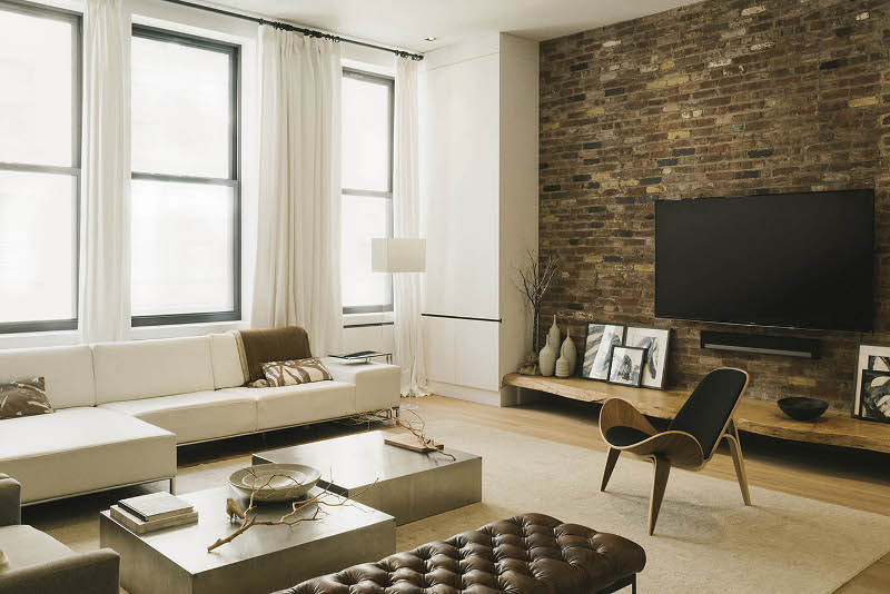
The second blog I visited was Desire to Inspire. On this sight they had very modern looking houses. I like the "clean" feel to these houses because I don't like clutter everywhere. There's also a lot of natural light to all of the living room spaces which I really like. I think there should be lots of natural light all throughout the home. Some of the wallpaper and decorations they use in the photos on this website aren't exactly my style, but I think the way the designers placed them looks
great. On this sight designers comment below their own pictures describing the meaning of their set up.

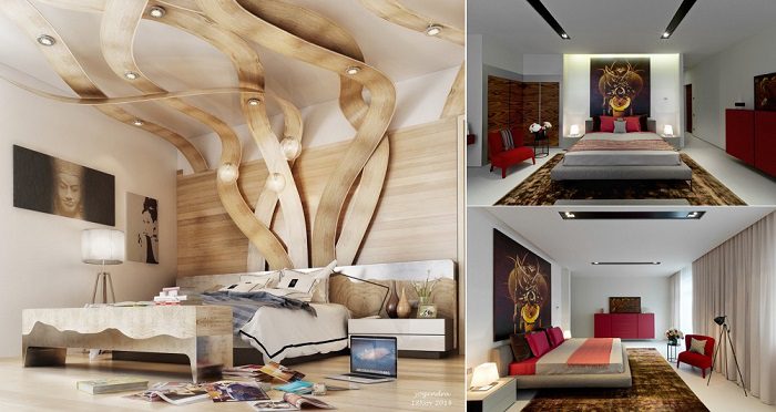
The final blog I visited was iCreatived. I liked this website because it portrayed lots of new ideas people wouldn't really think of at first. Some of them are a little weird, but I think it's cool to see all these pictures of new ideas people have. The pictures of different houses all have weird, warped shapes, and the different rooms sometimes combine something old with something new. The art and decorations on the walls are all very different and "out there" which is interesting to me.

Out of these three sites, my favorite has to be Houzz. (If I ever had enough money to afford these things) I could definitely see my self wanting the rooms in my house to look similar to some of the pictures on this site. I loved the furniture and different colors that were used on these model homes.
A trend I noticed between Desire to Inspire and iCreatived was the push to always have the most new and improved look. They wanted people to have things that are different, and original.

I really like the pictures you used for each of your websites>
ReplyDeleteThis comment has been removed by the author.
ReplyDeleteI like the one that looks like seaweed !!
ReplyDelete